Wednesday, March 5, 2014

In the Zone - Achieving your Flow

We've all found ourselves getting "in the zone" when we work. We lose track of time until "just a couple of hours" becomes all day. Whats happening to you isn't entirely some superhuman ultra focus, enabling you to ignore everything short of the urge to pee (and sometimes even that). What is happening is that you are entering a mental state of operation known as flow.


Flow is a mental state in which the individual transcends conscious thought reaching a heightened state of both concentration and calmness. It is characterized by energized focus, full involvement, effortlessness, and enjoyment in the process of whatever activity you are doing. In essence it is the complete absorption into what one does.

Being able to enter a flow state usually means that you are doing something that you enjoy and are good at, but that also challenges you. Achieving this requires a confidence in skill that matches the task at hand. I believe that if you know enough about what you are doing, and you have the confidence and skill level to do what you do without thinking about it at every single turn, you can allow your mind to let go enough to reach your state of flow.

When in a flow state you are practically immune to any internal or external pressures and distractions that might otherwise hinder your performance. You simply stop thinking about any other problems you might have and concentrate solely on the task at hand. In this way, achieving a flow state can become your very own version of therapy or a meditation of sorts.


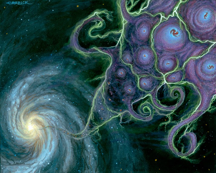
Below is a detail from a painting I did back in 2011. It was part of my thesis show in college and I was very strapped for time. This resulted in very very late nights and long long days of painting. For this particular piece I found myself so tired that I would doze off mid brushstroke, waking up periodically to find that I'd slashed green or red across the whole face, forced to start again from scratch. I can't remember much of the painting process but after dozing in and out of not quite sleep countless times the last thing I remember was waking up (or rather becoming aware) at my easel to the completely finished face shown below. 


I like to think of it as exaggerated proof that a flow state is the ultimate creative zone and that being in one is to be at the highest level of focus towards a particular task that you can be. To be so immersed in the task at hand that your brain can actually do it in it's sleep.


Wednesday, February 26, 2014

The Illusion of Ease


I want to take a moment to address the illusion of ease in painting and the difficulty with which an artist obtains it.

Below is a portrait of Mrs. Hugh Hammersley by John Singer Sargent...


I am a great admirer of Sargent and the apparent ease of his brushwork but it had never occurred to me that such ease was not a gift given upon reaching some level of skill where one can call themselves master. No, this ease was achieved by fighting tooth and nail with the canvas, demolishing all work that had been done before to start anew if just the slightest detail or shift of posture was not befitting the sitter.

Sargent would often repaint the heads of his sitters dozens of times. Each one from scratch. He would not reposition features or tinker with the details of a face as this meant the initial structure was wrong and had to be redone.The head of Mrs. Hammersley above was repainted no less than 16 times.

He painted his forms as a sculptor models his, laying in the broad forms first and letting the features blossom from within. They were never a separate thing to be applied to the face, they were always integral, from the very first stroke.

No matter how long he worked on a particular piece he had no qualms about destroying everything to start fresh if it was not to his satisfaction. Below is a portrait of Lady D'Abernon. After three weeks of painting her in a white dress, Sargent scraped out the painting at what would have been the last sitting. He then repainted her in a black dress in only three.


Sargent's paintings appear as if he completed them on a whim and that they flew from his brush with the littlest effort. He was able to achieve this because the images did in fact fly from his brush, though what you cannot see and must respect is the time spent behind those few remaining strokes on the canvas. The fact that countless hours were spent simplifying and perfecting the image in his mind's eye through painting and repainting until the perfect visualization of a form can pour out at once and create what we all see as a masterpiece done with ease.


References: I found the information in this post from the accounts of Sargent's process and methods by some of his students, Miss Heyneman and Mr. Henry Haley. A collected PDF of these compiled notes can be found on Craig Mullins' site here.

Wednesday, February 19, 2014

From Color to Sound

The following was taken from an account of a sitter being painted by John Singer Sargent in 1902:

My husband came several times to the sittings. On one occasion Mr. Sargent sent for him specially. He rode across the Park to Tite Street. He found Mr. Sargent in a depressed mood. The opals baffled him. He said he couldn't paint them. They had been a nightmare to him, he declared, throughout the painting of the portrait. That morning he was certainly in despair.

Presently he said to my husband: "Let's play a Fauré duet." They played, Mr. Sargent thumping out the bass with strong, stumpy fingers. At the conclusion Mr. Sargent jumped up briskly, went back to the portrait and with a few quick strokes, dabbed in the opals. He called to my husband to come and look: "I've done the damned thing," he laughed under his breath.

What appeared to interest him more than anything else when I arrived was to know what music I had brought with me. To turn from color to sound evidently refreshed him, and presumably the one art stimulated the other in his brain.


References: I found the information in this post from the accounts of Sargent's process and methods by some of his students, Miss Heyneman and Mr. Henry Haley. A collected PDF of these compiled notes can be found on Craig Mullins' site here.

Thursday, February 13, 2014

Faithful Portraiture

Below is an excerpt from some notes on John Singer Sargent. They have been compiled from a multitude of sources and can be found at Craig Mullins' site here.

It was a common experience for Sargent, as probably for all portrait painters, to be asked to alter some feature in a face, generally the mouth. Indeed, this happened so often that he used to define a portrait as "a likeness in which there was something wrong about the mouth." He rarely acceded, and then only when he was already convinced that it was wrong. In the case of Francis Jenkinson, the Cambridge Librarian (painting below), it was pointed out that he had omitted many lines and wrinkles which ought to be shown on the model's face. Sargent refused to make, he said, "a railway system of him."


While it is true that Sargent would almost never change his subjects features at their request he did exaggerate those features required for the most faithful likeness. In this way he certainly did not paint exactly what he saw but rather captured the essence of his sitter.

Below is the compared photograph and portrait of Coventry Patmore. The portrait having been done from life (not from the photograph) both dated to the mid 1890's.


Patmore thought very highly of Sargent having wrote of him: 

“He seems to me to be the greatest, not only of living English portrait painters, but of all English portrait painters; and to be thus invited to sit to him for my picture is among the most signal honours I have ever received.”

He was so impressed by the likeness that he wrote of the painting: 

"It is now finished to the satisfaction, and far more than the satisfaction of every one - including the painter - who has seen it. It will be simply, as a work of art, THE painting of the Academy."


Friday, January 31, 2014

Feedback Part 3

Paul Carrick came to my school as a guest lecturer during my second semester. He was there to share his experience as an illustrator with my class, to show us one of our options. It was the only thing that happened as far as my schooling went that taught me anything about illustration. In fact up to this point I wasn't even really aware of illustration being it's own field, or that you could be an illustrator.

One of the original paintings he brought in that stuck with me long after he left.

Hearing Paul and seeing his work solidified in me what I wanted to do. I had always been interested in fantasy and science fiction. Looking at the artwork of book covers, RPG rule manuals and Magic: the Gathering trading cards had made me want to become an artist but I never realized that these people were illustrators. It seems weird to say that now but I just didn't know back then that there was a difference let alone such a dichotomy between so called 'fine art' and 'illustration'. I just thought they were all artists and that these particular artists painted fantasy or science fiction. I could get into my opinions about the break between fine art and illustration but that seems like it belongs in a future post...


Paul Carrick helped to open my eyes to illustration as a business. All of a sudden I realized that if I wanted to be a serious professional illustrator that I had to learn to make a living at it, and that it wasn't going to be easy. This was something that I wasn't going to learn in school. I immediately started to search for any book, blog, podcast or video that might help me learn, not only to draw and paint, but how to run this business I was getting into. I was determined to know all that I could about the field so I would fully understand what I was getting into.

I stayed along after Paul's lecture to talk more about the field and exchanged emails with him, asking him if I could keep in touch and send him my work every so often. This ended up being one of the best things for me. Every so often we would exchange emails and he would direct me along giving me much needed feedback. He made me realize the importance of reference, showed me where it was and wasn't working for me. He helped me with lighting and focusing the viewer's attention, using visual clues in the image to make things more or less apparent or even staged. He was always encouraging me along the way, letting me know how far I had come from when he first saw my work.

This kind of encouragement is key to a young student and indeed will be present with one's teachers and peers but it is always helpful to have the opinion of someone out in the business who isn't always nearby. An outside mentor who can lend a fresh set of eyes to your work. They may see something and say something that hasn't been said, something that perhaps you're working towards slowly but haven't yet realized for yourself. This kind of feedback can help you on your way by leaps and bounds and I am very grateful to have that with Paul Carrick.

For those of you who don't know Paul's work the link to his website can be found again HERE. He specializes in all things Lovecraft and has worked on many projects including Chaosium's Call of Cthulhu line. Below are some of my favorites...


Thursday, January 30, 2014

Feedback Part 2

While they were all encouraging and they all held some bits of information that would help guide me in the coming years there was one email I received back in 2008 that would do more to influence my growth than all of the others.

It came from Todd Lockwood.

For those of you who don't know of Lockwood's work, please go check it out. He is an amazing painter and in many's eyes his is the last word when it comes to dragons.


Following are some excerpts from his email...

"Use good reference when you draw. Drawing out of your head can be fun, but if you want to learn and draw well, life-drawing is a must. It's an invaluable way to learn the subtleties of the human form (something that few can ever really master entirely), so have a regular place to draw. At home, if you have a camera, take photos from which to draw. A digital camera can be a wondrous asset if you have access to a computer and printer. I also strongly recommend a book called 'Drawing From the Right Side of the Brain' by Betty Edwards. It contains some amazing exercises for stimulating the part of your brain that sees things as they really are, and can help you break some bad habits that you have taught yourself when you were learning the standard, over-simplified symbols of How Things Look. Every first grader knows that a nose is an L-shape, or upside-down 7, for example. It's not true, obviously, but even talented artists will have set routines that they run when they are drawing an ear, say, or an eye, that may contain inaccuracies that escape the casual observer. The result is a face or figure that is drawn according to a list of symbols rather than a detailed observation of the reality, complete with light effects, shadows, perspective, and so on. Accurate observation is essential to a good drawing. If you always draw from your head, you will not exorcise those flawed routines."

"Art is far more about knowing what things look like and why than it is about media, but digital media offer too many temptations that can blunt your learning ability. I recommend highly that you draw with a pencil, kneaded eraser, and a paper blending stick or stomp and concentrate on making the best black & white images that you can for now."


"There is a good resource available online: you can view the art texts of Andrew Loomis, for FREE, here: http://www.fineart.sk/photo-references/andrew-loomis-anatomy-books. Loomis was an illustrator and teacher of art in the forties and fifties. What most distinguishes his career is the legacy in these books. He was a master teacher, and covers all the basics thoroughly, with terrific illustrations to boot. He's an amazing teacher"


He then gave me a mini lesson on light and shadow. These points as well as some others that Todd touches upon in his class at the SmART School can be found in his recent blog post on Muddy Colors here: http://muddycolors.blogspot.com/2014/01/narrative-illustration.html


LIGHT & SHADOW

"Here's a tip for shading: light acts like ping-pong balls. A particle of light hits a surface and bounces off at a predictable angle, like a billiard ball banking off of a side-rail. I'm attaching some little jpegs that demonstrate this..."


"I'm showing you two things: the light that bounces directly into your eye, as a highlight (solid lines), and the light that doesn't, which is the ambient light (dashed lines). You can think of ANY surface as a mirror which throws light back. That's easy with a flat surface, because mirrors are flat. Round surfaces are otherwise no different. Light strikes the surface and bounces off most powerfully at an IDENTICAL, but OPPOSING angle. Just like a billiard ball. So, the light bouncing toward your eye- the only light you will see, obviously- will be strongest where it is coming off of that kind of bounce. It's relative to the placement of the light source and the location of your eye, in space. A highlight IS NOT strongest where the surface is closest to the light source. It is strongest where the angle of that surface is MOST LIKELY to bounce the light straight toward your eye. That is the red lines. The ambient light is the light that is bouncing off of irregularities in the surface, and it goes in every direction. There is light bouncing everywhere, all the time. We only perceive the light that happens to be bouncing to the exact spot where our pupils are. Some of it will bounce back toward another surface, then off of that second (or third) surface and into our eyes. That's reflected light, or fill light (the solid purple line)."


There will be a tendency for a surface to appear brighter toward the light source, but that is different than the actual highlight. Look at the drawing of the brick to see what I mean. There is a point of demarcation on the corner edge of the brick where the highlight is most likely, but the light that strikes the face of the brick as it falls away from the light is doing so at an ever increasing angle. This will be especially true where the light source is close. The more extreme that angle becomes, the less likely it is that the surface irregularities will bounce some of that ambient light toward your eye, thus the light appears to "fall away".


"If you think of a surface as a mirror, the highlight will appear wherever that spot is that would have been a reflection of the light, were it an actual mirror. Make sense? Some surfaces are great at reflecting, like mirrors. Some aren't, like walls. But walls are still flat enough that there will be a 'hot spot'. Look at the walls where you are sitting right now and find the hot spot"

"That's all you need to know about how light works to start studying it. Everything you draw or paint is either a flat or curved surface, and the rules will apply. Even water works that way, though transparency is another issue. Your job as you draw is to see the light bouncing. The better you know the volume and construction of the forms of the objects, the better you will understand how light bounces off of and onto those objects, so that is important too."


While I never did read Drawing From the Right Side of the Brain, the books by Andrew Loomis (especially Figure Drawing for All it's Worth) and Todd's excellent mini lesson jump started me on my quest. Thank you Todd.


UP NEXT: Paul Carrick

Wednesday, January 29, 2014

Feedback Part 1

As a young artist just getting into art school you live and die by the feedback of your teachers and peers. Some is good, but most is bad. It is up to you to weed through the endless critiques and comments to find those choice moments that strike a chord with you. This three part series will highlight some of my own choice moments. I hope some of this may resonate with you like it did with me.

After my first year of art school I was stricken by something a professor had said to me. At my final critique he asked me what it was I wanted to do after I graduated to which I replied fantasy and science fiction illustration. He asked me to look out at what the fine art seniors had done for their thesis show that year and said to me that you should just leave and go to a different school because no one is doing the type of work that interests you here.

I was a fine art major at a very small school and there really wasn't anyone doing the type of work I wanted to get into. He was absolutely right and maybe I should have taken his advice, but I stayed for a multitude of reasons, not least is the caliber of teachers I had and would come to have. I was there first and foremost to learn how to draw and paint but what he said stuck with me throughout, and in conjunction with meeting Paul Carrick (I'll get to that meeting later in this series), made me hungry for knowledge outside of my schooling.

Thank you Steve Novick for giving me that initial push to learn what I needed to learn.


My first big step came in 2008 during my first summer break. I felt that the feedback of my professors wasn't enough and that what I really needed was the opinions of the people whose work I admired and followed closely. Professionals in the field of illustration, the very people who drew me to it in the first place. I compiled a list of my favorites and sent out my portfolio in a shotgun blast of emails hoping for the best. Surprisingly enough I got several responses within the next few weeks and they were invaluable to me in my artistic growth over the next few years. To the artists both named here and not, that took time out of their day to send me these, I am extremely grateful. You encouraged and continue to encourage a young artist finding his way in this business. Below is a selection of quotes from those emails...


 RANDY GALLEGOS
"Drawing is the blueprint of painting--without great drawing, color can't do its job."


"Focus your portfolio. Pick the genre of artwork you're going to focus on and do lots of that. A good portfolio should have 8-12 pieces demonstrating different subject matter within the same basic genre. No more, no less, and no weird, out of left field stuff. If you want to do fantasy book covers or Magic cards, don't show your prospective clients celebrity portraits. The reverse applies as well, naturally. You don't send a picture of a dragon to Time Magazine in order to score editorial art gigs. And of course, ditch the school work. People know it when they see it, and they won't hire you if they think you're a student or don't have professional experience. It's your job to create the illusion that you are the consummate professional...until you are."


"You never outgrow the need to learn. The MAIN thing is to get your hand very much at home with the language, and the only thing for that is gobs and gobs of practice."


"When you paint, really concentrate on the textures and feel of the different materials in the image. Skin, metal etc. The best way I found was to imagine the feel of each material as you paint it. It's tricky but you'll know when you get it. it's really like a light turning on in your head."

"Post your work on a site like conceptart.org in their sketchbook section. You will get a lot of honest critiques from professional and amateur artists alike. Many artists have made huge leaps through this site. Be humble and take constructive criticism to heart."

"In the end you just have to practice and make each piece of work better than your last. be aware of your weaknesses more than your strengths and work on them. Recognize what makes other artist's images work and try and introduce it to your compositions."


UP NEXT: Todd Lockwood gives me my first lesson on light and shadow...